don j myers masthead

ARCHITECTURAL RENDERINGS

The Adventures of Pluto Nash (WB)
moon beach showgirl pluto nash
I did some of my best work in one of Warner Brother's biggest flops! Sigh. At this time the 3D render engine Lightwave was in buggy 6.5 mode, my CPU had a flaw, plus various network and software licensing problems made me wonder if I could ever render this stuff out! Fortunately the the pan shot to the entrance of Moon Beach was both the first shot in one of the trailers and the first shot in my boss's FX company trailer as well. I'm glad my outside design looked like the inside design, which i had never seen. Too bad folks did a ton of work on the interiors to "Las Vegas on the Moon" that were not used. These "bigatures" were large enough a stooped modelmaker could walk around the entrances to a mini Soviet casino, a Roman one, etc.  So much work was done and the plan was to matte in human elements later. AKA crowd scenes on the Las Vegas strip of the future.

But when the studio realized the movie stunk they refused to pay for the extra expense of adding in motion tracked CGI pedestrians as had been the plan. Next to nothing of these modelmaker's detailed physical labor and craftsmanship remains. So my shot ended up having to "carry" the idea of what amazing scale the place had. "The place" meaning almost the setting of the last 30% of the movie.

My fellow animators freaked out when I was rendering shadows, reflections and refractions with MOTION BLUR! "You are hogging our render time on the farm!" But I explained that the blur was mostly a post processing effect. This was an issue as all animators were jockeying for render farm time for their Lightwave scenes. The worst area was the bouncing dice which reflect and refract. I think I ended up rendering them seperately and comping them back in.

A big problem for me was the lasers looking too "jaggy" no matter what I did. Of course "you can't see lasers in a vacuum on the moon" I cried but my tears turned to moon dust in my boss's gaze! Meanwhile by that point in the flick the audience had either fallen asleep or left! It lost so much money just so Eddie Murphy Inc. could earn $18,000,000.  All the funny parts are in the trailer, particularly the hilarious "Hillary Money."


moon beach from a distance
Moon Beach Far Away
I made the left side of the city
moon beach entrance part 1
moon beach approach part 1
Beginning of shot
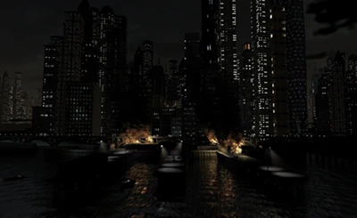
Birds of Prey TV Series (WB)
gotham city docks on fire
Once upon a time there was a TV network called the WB, because Time-Warner and The Tribune Co. had a broadcast baby. One of the series on the new network was set in the Batman universe.  Unfortunately they spent all their VFX budget on the pilot! This is more common than it sounds. So they endlessly re-used my opening shot in different ways. Forwards, backwards, etc.

Sadly the New York Times stated, and my boss concurred, 'The show makes Batman look like a 'deadbeat dad'."

Nevertheless my single long shot going from map of Gotham City to Cat Woman dying in the street in medium CU could have been a demo reel of its own. It is amazing that, at this time, one person could create an opening shot of a show on a fledgling national network (The WB). The trick was it was only rendered at 720x486! Unlike the giant billboard sized artwork I created using Lightwave 3D. Today so much detail is needed just for a video game that no one person can come up with such things.


Deep Blue Sea (WB)
deep blue sea underwater view of explosion
The good news is that the director of the first studio feature film I worked on said of the shot at left "It is my new favorite shot in the movie!" The bad news is that that director was Rennie Harlin, the monster of Hollywood!

He terrorized the crew. He had a childish meltdown that make a career low for Jeff Okun, who later on became the head of the Visual FX Society in Hwd.

He blew up everything. He had a pyromanic delight in blowing up solid concrete and metal walkways. Was the concrete mixed with TNT when it was laid? Absurd. My boss shook his head at rough edits and said "The critics will say 'Too many explosions!" He was right and so very many explosive shots, expensive shots were cut out. The purchase of the pyro was a waste of budget. Risking lives unnescessarily. Taking money away from the FX teams animating the sharks and storms right when they needed it most. Late post.

This movie was the last of the "analog sets first" movies and the first of the "digitally scanned sets" movies. WB built this massive set at the same place they shot Titanic with sets that could sink. But the above the water part was a set built on a bluff which tricked the eye into thinking far away ocean was continuous (in theory). This is where the Titanic shot the lifeboats getting away and the boat freaking out.


THey wanted a 3D built set based on tear down photos and bad faxes. not how they do it today! I had to come up with a model for long shots and semi-close ups of an entire facility. Today the whole thing would have been designed on a computer, built in physical models hero and wrecked versions. Then CGI would have been used to mirror the other side of the compund.

Instead I had  a bad fax, rough sketches and precious, precious photos taken by my boss at the set as they were TEARING IT APART. Fortunately the architecture was easy to model but we had to texture the thing from a  post mortem state. Today it would be so the opposite.


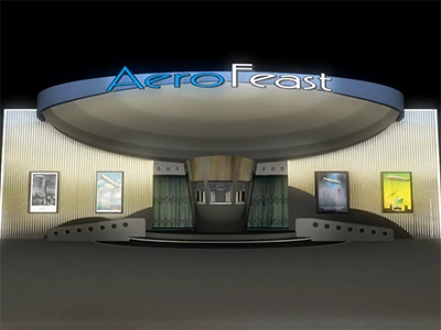
Aerofeast Themed Dining
aerofeast themed dining
This high profile tourist venue was designed for a theme park, a Downtown Disney/Universal Citywalk/Las Vegas hotel audience demographic. You could go inside and see all these screens synced into a circlevision 360 display as if you were in a zepplin flying around. Every few minutes the scene would change from drifting in the clouds to scary creatures underwater to a video game etc. So you could also buy time on the screens to play games.  A real world camera rig with a 360 view could record flying over the Grand Canyon and that could be output on the window-like screens. Theoretically you could also float over massively multiplayer online games from above and fly around the battles as they happened.

These 3D rendered sets are based on detailed cardboard models made by the architect and also his scanned in blueprints. I love the way the screens envelope all views and the dumbwaiter is great. The blackness and the use of inexpensive chrome materials showed the designer knew what he was doing. The screens were the stars. They light the room in a fascinating way.  But I felt it should all be circular. This ruins the square footage of the second floor as it must shrink. Sigh. Less space to sell drinks and nibble food.

Unfortunately I KNOW that the oval design of this venue would not optically work with the idea of virtual or real world cameras. I told the designer "Disney called it CIRCLEVISION 360 for a reason. It must be a circle shape, not a football shape." The idea of shooting real world footage cannot deviate from the Disney approach. It is simple optical math that an architect should know! I tested it in a simulation and it did not work ovally. There was weird camera FOV overlap."

The idea was that, although the venue was expensive, it was also one of a kind. And tourists would be willing to pay extra for themed drinks and cocktail food.

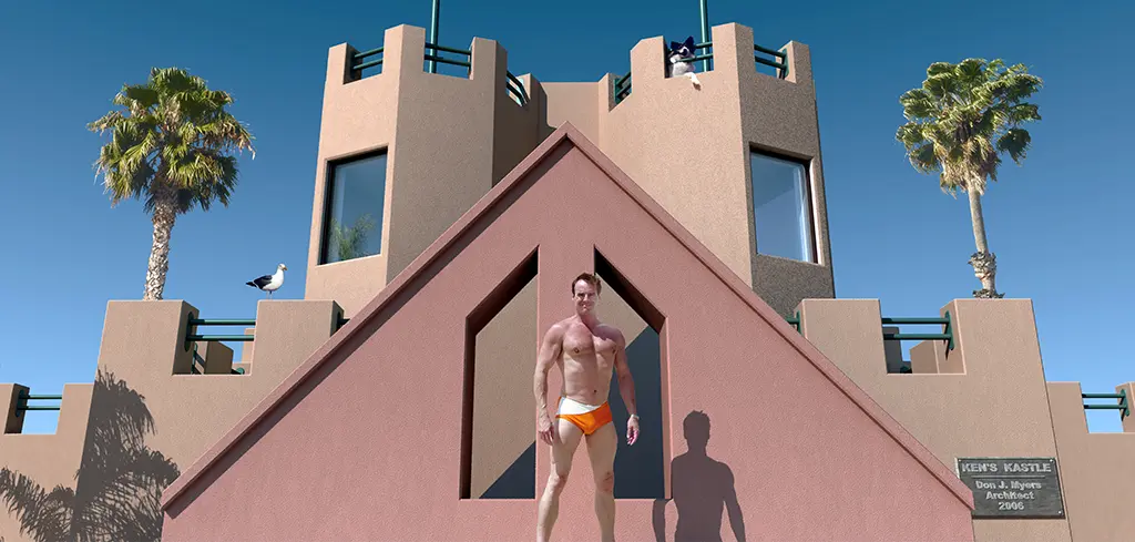
But the highly talented and creative designer and I had a falling out. See also my section "ARCHITECTS ARE FASCINATING MONSTERS." So I bailed on animating the project. Then, like clockwork three years later, Venice Beach Ken called and wanted me to make him a circular version of the venue. This behavior is called "narcissistic hoovering." I said "get out of my life."


bodybuilder venice castle